B&P Design, the division of the communications agency Barabino & Partners dedicated to corporate identity and visual communications, has worked on the creation of a new visual identity for an independent advisory firm specialising in integrated consulting of high standing to companies. B&P Design created a rebranding project rooted in the ideation of a new name, logo and payoff to establish a new visual identity.
“Partners” has thus become “Wepartner” – Indipendent Advisory Firm. A new name and a new payoff to strengthen the communication potential of the company’s raison d’être: being partners close to their clients every day.
Why is it important to build a distinctive visual identity?
Visual communication has, without a doubt, the strongest effect from a communication standpoint. Our powerful ability to recall images can be attributed to the fact that our brains are naturally predisposed to remember messages delivered through this medium. As such, visual communication allows us to reach more effectively the objective of anyone who is trying to get a point across: being remembered.
For companies, the main elements of visual communication that encapsulate and synthesise their storytelling and positioning are the brand and the payoff. These two elements characterise all communication: from web design to marketing campaigns, from business cards to stationery.
The transformation from “Partner” to “Wepartner”, accompanied by a clearly defined payoff that identifies their professional activities, highlights their unique selling proposition and makes their positioning immediately recognisable. The name can be interpreted in two ways. “Wepartner” as in the community of partners that, thanks to the varied and diversified competences of its cross-disciplinary teams, offers an integrated consultancy. It can also be interpreted as “us being in partnership with…”, reading the word in its verb form, once again placing the focus on being close to the client.
The logo, a contraction of the full name, calls on the “We” as well as the “P” that represents the partners and, thus, the people and professional capacity of the consultancy.
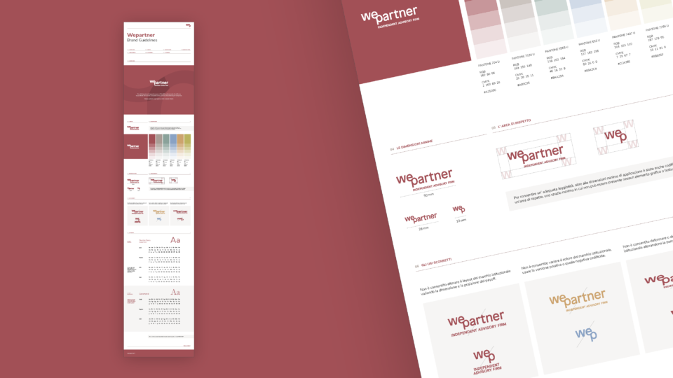
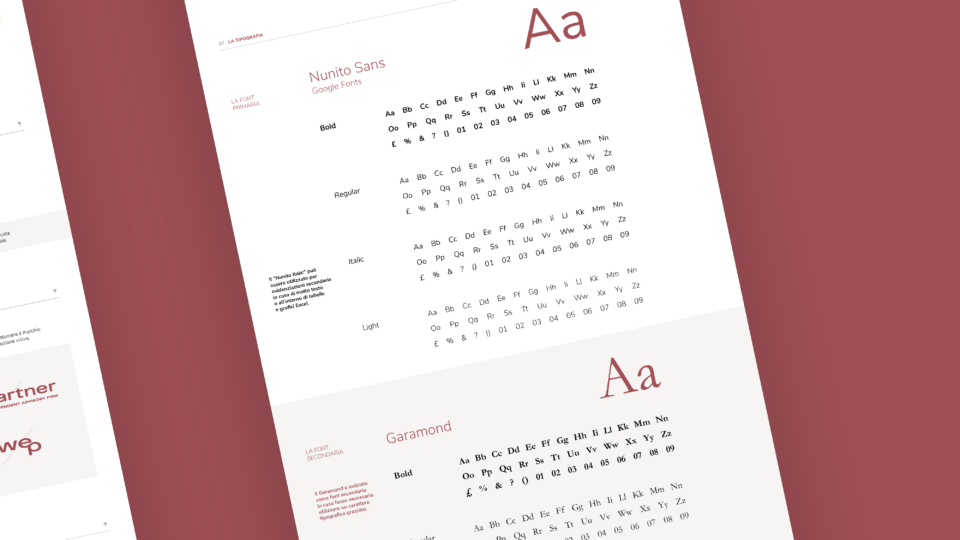
The development of a new visual identity culminated with the creation of a brand manual. It is a fundamental document that guides all visual communication, such as choosing fonts, colours and graphic elements in all their various uses, such as social media and PowerPoint presentations.
categories: news / eventi


